How to Use the Material 3 Color Scheme Builder Prompt to Turn a Brand Color Into a Full Theme
Turn a brand color into a complete Material Design 3 color scheme the way Material Theme Builder does: pick the seed and scheme variant, map primary, secondary, tertiary, error, surface, and surface container roles for light and dark, check on color contrast pairs, handle a brand color that clashes with its generated tone, and export tokens for Jetpack Compose, Flutter ThemeData, and CSS custom properties.
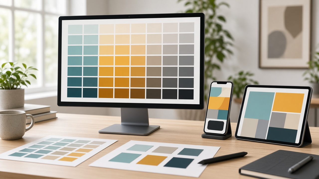
Material Design 3 builds an entire color system from a single seed color. That is powerful, but it surprises teams the first time they try it. The generated primary color is often not the exact brand hex, dark mode shifts everything to different tones, and an accent color can end up clashing with the generated palette. The Material 3 Color Scheme Builder: Seed Color to Tonal Palettes, Light and Dark Color Roles, Contrast Levels, and Token Exports for Compose, Flutter, and CSS prompt walks through the decisions a product designer makes before exporting a theme: which color becomes the seed, which scheme variant keeps the brand recognizable, how each color role is used, which contrast pairs to check, and how to export tokens for the platforms you ship on.
What the prompt produces
- A seed decision that picks the seed, assigns other brand colors as custom colors, and chooses a scheme variant.
- Tonal palette notes explaining which tones each role uses in light and dark mode and where your exact brand color may or may not appear.
- A color role table for light and dark covering primary, secondary, tertiary, error, surface, outline, and the surface container roles, with what each is used for.
- Contrast checks for the pairs that matter most, with target ratios and how contrast levels change them.
- Brand clash fixes for cases where the exact brand hex must appear, such as a floating action button.
- Token export skeletons for Jetpack Compose, Flutter, and CSS custom properties.
- A QA checklist for dynamic color and light and dark screenshots.
How to fill the inputs
BrandColors lists each brand color as a hex value and the role you want it to play, such as main brand, accent, or alert.
SchemeVariant is your preference among Tonal Spot, Fidelity, Content, Vibrant, Expressive, Neutral, and Monochrome. If you have none, say what matters most, such as keeping the brand color recognizable.
Platforms names how the theme is consumed: Jetpack Compose, Flutter, CSS custom properties, or Figma variables.
ContrastNeeds sets which contrast levels you support and whether Android dynamic color from the wallpaper is allowed.
KeyComponents lists the components that must look on brand, such as the app bar, floating action button, buttons, chips, and navigation bar.
Reading the example output
The example themes a product with a teal brand color, a marigold accent, and a red used only for destructive actions:
- Fidelity is chosen. It keeps the primary container close to the brand teal instead of softening it.
- The accent becomes a custom color. Marigold maps to tertiary for highlights only.
- Tones are explained, not guessed. The output names which tone each role uses and leaves exact hex values as placeholders to read from Material Theme Builder.
- Roles are tied to components. The floating action button uses the primary container, selected chips use the secondary container, and the navigation bar sits on a surface container.
- Contrast pairs are listed with targets. Text on primary, icons on the container, labels on the navigation bar, and borders on surface.
- Exports are ready to fill. Compose color schemes with a dynamic color switch and CSS variables with a dark mode media query.
Tips for better results
- Generate the scheme in Material Theme Builder with the same seed and variant, then paste the real values into the token skeletons.
- Check contrast in both light and dark mode. A pair that passes in light mode can fail in dark mode.
- Use surface container roles for layered backgrounds instead of inventing new grays.
- Keep custom colors to a minimum. Each one adds roles you have to maintain.
Mistakes to avoid
- Do not force the exact brand hex into every role. Let the system generate tones and reserve the exact hex for one or two places.
- Do not guess hex values or contrast ratios. Measure them.
- Do not forget dynamic color. If it is allowed, test that your logo and key brand moments still look right.
- Do not export tokens with names that differ across platforms. Matching names make handoff much easier.
Who it is for
Product designers setting up a new design system, Android and Flutter developers implementing themes, front end teams moving to CSS custom properties, and brand teams adapting an existing palette for apps.
Related PromptDig links
Start with the Material 3 Color Scheme Builder: Seed Color to Tonal Palettes, Light and Dark Color Roles, Contrast Levels, and Token Exports for Compose, Flutter, and CSS prompt and paste your brand colors and platforms. To find more prompts for designers, Browse more prompts. If you have a design system prompt your team relies on, Share a prompt.