🎯 Design
Material 3 Color Scheme Builder: Seed Color to Tonal Palettes, Light and Dark Color Roles, Contrast Levels, and Token Exports for Compose, Flutter, and CSS
Turn a brand color into a complete Material Design 3 color scheme the way Material Theme Builder does: pick the seed and scheme variant, map primary, secondary, tertiary, error, surface, and surface container roles for light and dark, check on color contrast pairs, handle a brand color that clashes with its generated tone, and export tokens for Jetpack Compose, Flutter ThemeData, and CSS custom properties.
0Reviews
Prompt
Act as a product designer who maintains a Material Design 3 theme for an Android and web product and has shipped brand colors through Material Theme Builder without breaking contrast in dark mode.

Inputs:
- Brand colors as hex values with the role each should play (main brand, accent, alert): [BrandColors]
- Scheme variant preference (Tonal Spot, Fidelity, Content, Vibrant, Expressive, Neutral, Monochrome) or no preference: [SchemeVariant]
- Platforms and how the theme is consumed (Jetpack Compose, Flutter, CSS custom properties, Figma variables): [Platforms]
- Contrast level support needed (standard, medium, high) and whether dynamic color from wallpaper is allowed on Android: [ContrastNeeds]
- Components that must look on brand (top app bar, FAB, filled buttons, chips, navigation bar): [KeyComponents]
- Output format: [Format]

Generate:
1. Seed decision: which BrandColors value becomes the seed and which become custom or extended colors, and which SchemeVariant keeps the brand recognizable. Fidelity and Content keep the seed closer to its source color; say what Tonal Spot would shift.
2. Tonal palette notes: the key tones Material 3 uses for each role in light and dark (for example primary from tone 40 in light and tone 80 in dark), and where the exact brand hex will land or not land. Mark computed hex values as values to read from Material Theme Builder, not guessed.
3. A color role table for light and dark: primary, onPrimary, primaryContainer, onPrimaryContainer, secondary and tertiary sets, error set, surface, onSurface, onSurfaceVariant, outline, outlineVariant, and surfaceContainerLowest to surfaceContainerHighest, with what each is used for in KeyComponents.
4. Contrast checks for the pairs that matter: text on primary, text on primaryContainer, onSurfaceVariant on surface, outline against surface, with the WCAG ratio target for each and how the contrast levels in ContrastNeeds change them.
5. Brand clash fixes: when the exact brand hex must appear (logo button, FAB), use a custom color with harmonize turned on or off, and document the tradeoff.
6. Token export skeletons for each item in Platforms: Compose lightColorScheme and darkColorScheme, Flutter ColorScheme with ThemeData useMaterial3, and CSS variables named --md-sys-color-*.
7. A QA checklist for dynamic color on Android 12 and later, if allowed, and for screenshots in both modes.

Constraints:
- Do not invent computed hex values or contrast ratios. Use [hex from Theme Builder] placeholders where a tool must calculate.
- No em dashes.
Instructions
Replace every [bracket] with your details before running. Works on ChatGPT, Claude, and Gemini.
Generated Output
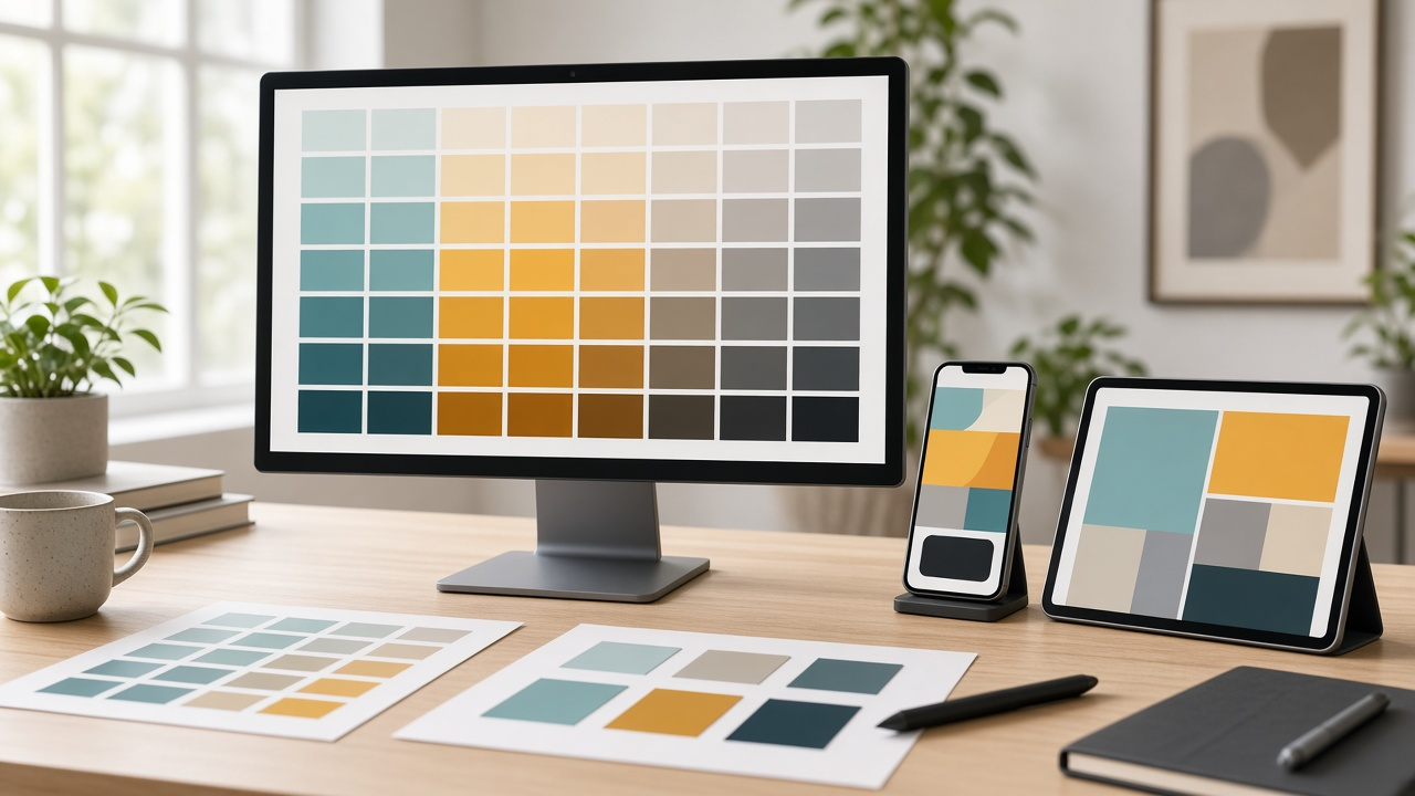
This image was generated using the prompt above.
Examples
Example Input
BrandColors: main brand #0F7B6C teal; accent #F2A541 marigold; alert brand red #D7263D used only for destructive actions
SchemeVariant: no preference, but the teal must still read as our teal
Platforms: Jetpack Compose app and a React web app using CSS custom properties
ContrastNeeds: standard and high; dynamic color allowed on Android only if the user turns it on
KeyComponents: FAB, filled buttons, navigation bar, filter chips
Format: decisions, role table, contrast checks, token skeletons
Example Output
1. Seed decision
Seed: #0F7B6C teal. Variant: Fidelity, so primaryContainer stays close to the brand teal instead of drifting toward a softer Tonal Spot teal. Marigold #F2A541 becomes tertiary through a custom color named accent. Brand red stays out of the scheme and maps to the error role only if it passes contrast; otherwise keep the generated error and use red only in the logo.

2. Tones
Light: primary from tone 40, onPrimary tone 100, primaryContainer tone 90. Dark: primary tone 80, onPrimary tone 20, primaryContainer tone 30. The exact #0F7B6C may not equal any of these. Read all values from Material Theme Builder with seed #0F7B6C and Fidelity.

3. Role table (excerpt)
| Role | Light | Dark | Used for |
| primary | [hex from Theme Builder] | [hex] | Filled buttons, active nav indicator icon |
| primaryContainer | [hex] | [hex] | FAB background |
| onPrimaryContainer | [hex] | [hex] | FAB icon |
| secondaryContainer | [hex] | [hex] | Selected filter chips, nav indicator pill |
| tertiary (accent) | [hex] | [hex] | Highlight badges only |
| surfaceContainer | [hex] | [hex] | Navigation bar background |
| outlineVariant | [hex] | [hex] | Unselected chip borders, dividers |

4. Contrast checks
- onPrimary on primary (button labels): target 4.5:1.
- onPrimaryContainer on primaryContainer (FAB icon): target 3:1 for icons.
- onSurfaceVariant on surfaceContainer (nav labels): target 4.5:1.
- outline on surface (text field borders): target 3:1.
Export the high contrast scheme as a second set and switch to it when the user's contrast setting is raised.

5. Brand clash
Marketing wants the exact #0F7B6C on the FAB. Add a custom color fab_brand with harmonize off, and pair it with an on color read from Theme Builder that passes 3:1. In dark mode, test it against surface; if it looks heavy, use primaryContainer instead.

6. Tokens
Compose:
private val LightColors = lightColorScheme(primary = Color(0xFF[hex]), onPrimary = Color(0xFF[hex]), primaryContainer = Color(0xFF[hex]))
private val DarkColors = darkColorScheme(primary = Color(0xFF[hex]), onPrimary = Color(0xFF[hex]))
MaterialTheme(colorScheme = if (useDynamic && Build.VERSION.SDK_INT >= 31) dynamicLightColorScheme(context) else LightColors)
CSS:
:root { --md-sys-color-primary: [hex]; --md-sys-color-on-primary: [hex]; --md-sys-color-primary-container: [hex]; }
@media (prefers-color-scheme: dark) { :root { --md-sys-color-primary: [hex]; } }

7. QA
Screenshot FAB, buttons, chips, and nav bar in light, dark, and high contrast; with dynamic color on, confirm the brand logo still shows the exact teal.