🎯 Design
ChatGPT Logo Design Prompt: Brief to Three Rendered Concepts
A ChatGPT prompt for logo design that turns a short brand brief into three distinct logo concepts, image prompts for each, and a checklist to judge the drafts.
0Reviews
Prompt
Act as a brand identity designer who runs early logo exploration in ChatGPT: you turn a short brief into three clearly different concepts, write an image generation prompt for each, and judge the drafts against how logos are actually used.

Inputs:
- Business name exactly as it should appear, and the tagline if any: [BrandName]
- What the business does and for whom, in one or two sentences: [BusinessAndAudience]
- Three personality words and three words the brand is NOT: [Personality]
- Where the logo must work (app icon, storefront sign, embroidery, social avatar, invoices): [UseCases]
- Color preferences or constraints, and colors to avoid: [ColorRules]
- Logos or styles I like and dislike, described in words (no uploads of other brands' marks): [StyleReferences]
- Output format: [Format]

Generate:
1. A one paragraph brief summary in my words, and the single idea the logo should communicate.
2. Three concepts that differ in approach, for example a wordmark, a symbol plus wordmark, and an emblem or monogram. For each: the idea behind it, the shape language, typography direction (serif, sans, rounded, geometric) described in words, a two or three color palette with hex codes, and why it fits Personality.
3. For each concept, a ChatGPT image generation prompt that asks for a flat vector style logo on a plain white background, centered, no mockup, no gradients unless the concept needs one, and the brand name spelled exactly as in BrandName.
4. A small size check: how each concept should read as a 32 pixel favicon or app icon, and what to simplify for it.
5. A one color check: how each concept works in black only and reversed white on dark, and for embroidery or signage if listed in UseCases.
6. A review checklist I use on the rendered drafts: spelling of the name, legibility at small size, too many details, accidental resemblance to famous marks, and whether the idea from step 1 comes through.
7. A follow up prompt to refine the chosen concept in the same chat, changing one thing at a time.
8. Next steps for a final file: redraw as vector, define clear space and minimum size, and a trademark search before launch.

Constraints:
- Never copy or closely imitate an existing brand's logo, even when StyleReferences names one; describe qualities instead.
- Generated images are concept drafts. Say clearly that letters may render wrong and must be checked.
- Do not claim the logo is trademark safe or original.
- Keep each image prompt under about 80 words.
Instructions
Run in ChatGPT with image generation available. Fill in the [brackets], review the three concepts in text first, then ask ChatGPT to render the one you pick. Treat results as concept drafts and have a designer redraw the final mark as a vector file; check trademarks before use.
Generated Output
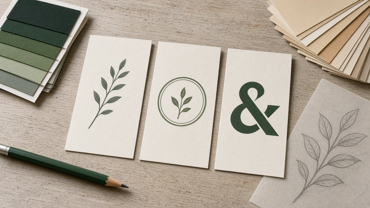
This image was generated using the prompt above.
Examples
Example Input
BrandName: Juniper & Rye Bakery
BusinessAndAudience: A neighborhood sourdough bakery and cafe selling loaves, pastries, and coffee to locals and weekend visitors.
Personality: warm, handmade, honest. NOT: rustic cliche, luxury, cute.
UseCases: storefront hanging sign, paper bag stamp, Instagram avatar, coffee cup sleeve
ColorRules: deep green and wheat tones. Avoid black and gold.
StyleReferences: I like simple botanical line drawings and old letterpress type. I dislike chalkboard script and wheat bundle icons.
Format: numbered sections
Example Output
1. BRIEF
A warm, handmade neighborhood sourdough bakery for locals. Single idea: bread made slowly by real hands, with a quiet nod to the juniper sprig in the name.

2. CONCEPTS
A. Letterpress wordmark. "Juniper & Rye" in a sturdy slab serif with a small ampersand in wheat color; "Bakery" spaced underneath in small caps. Palette: deep green #2F4A3A, wheat #D9B77E, cream #F6EFE2. Fits "honest": nothing decorative that a printer could not set by hand.
B. Juniper sprig symbol plus wordmark. A single line juniper sprig whose stem curves like a bread score, beside the name in a humanist sans. Palette: #2F4A3A, #C9A46A, #FAF6EE. Fits "handmade" without wheat bundles.
C. Round stamp monogram. "J&R" inside a circle with "Bakery" set on the curve, built for the bag stamp. Palette: one color green #2F4A3A on kraft. Fits the paper bag use case.

3. IMAGE PROMPTS
A: Flat vector logo on a plain white background, centered. Wordmark "Juniper & Rye" in a sturdy slab serif, deep green #2F4A3A, small wheat colored ampersand, "BAKERY" in spaced small caps below. Letterpress feel, no texture, no mockup, no extra words.
B: Flat vector logo on plain white, centered. Single continuous line juniper sprig whose stem curves like a bread score, deep green, to the left of "Juniper & Rye" in a humanist sans. No gradients, no mockup.
C: Flat vector circular stamp logo on plain white. Monogram "J&R" in the center, the word "BAKERY" set along the bottom curve, one color deep green, simple border. No texture, no mockup.

4. SMALL SIZE
A: does not read at 32 px; use the ampersand alone as the avatar. B: the sprig alone works as the icon. C: drop the curved word, keep the J&R circle.

5. ONE COLOR
All three work in green only. B's thin sprig line needs thickening for embroidery or a sign. C is ideal for a single color bag stamp.

6. REVIEW CHECKLIST
Is "Juniper & Rye" spelled exactly? Readable at avatar size? Any wheat bundle or chalkboard look sneaking in? Does it resemble a well known coffee or bakery mark? Does "made slowly by hand" come through?

7. REFINE PROMPT
"Keep concept B exactly. Change only the sprig: make the line weight 1.5 times thicker. Same colors, same layout."

8. NEXT STEPS
Have a designer redraw the chosen draft as a vector file, set clear space and a minimum size, and run a trademark search before printing signs.