How to Use the ADA Tactile Room Sign Schedule Prompt for a Wayfinding Package
Build the sign type list, message schedule, and location rules for interior room identification and directional signs under the 2010 ADA Standards section 703: which signs need tactile characters and braille, character and pictogram specs, mounting heights to baseline, latch side placement, and the questions to send the architect before fabrication.
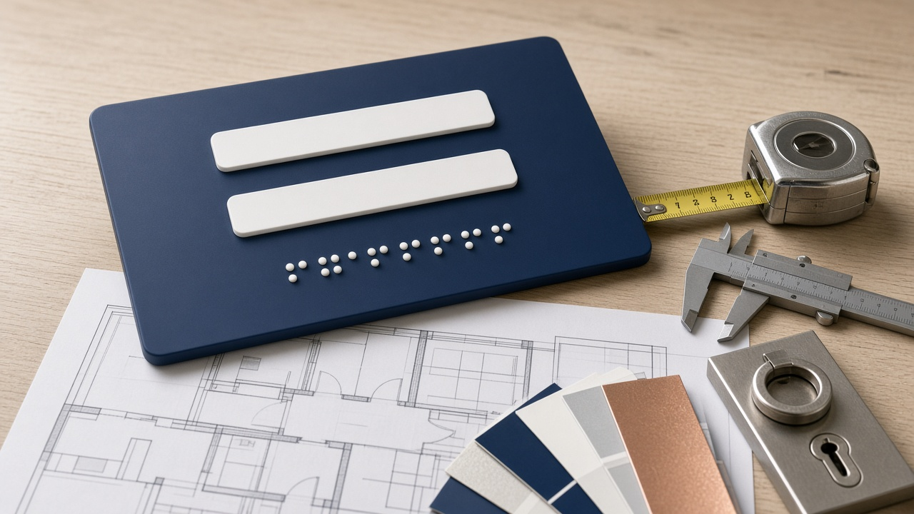
Interior signage looks simple until it has to pass inspection. Room identification signs need raised characters and braille, the characters have to be a certain size and style, and the sign has to sit at the right height on the right side of the door. Brand typefaces, glass sidelites, and short walls beside doors all push designs out of compliance, and a failed sign is remade at someone's cost. The ADA Tactile Room Sign Schedule for a Wayfinding Package: Section 703 Raised Characters, Braille, Mounting Heights, and Door Side Locations prompt builds the sign types, specs, and message schedule around section 703 of the 2010 ADA Standards from the start.
What the prompt produces
- A sign type list that separates tactile room identification signs from visual only directional and informational signs, with a code for each type.
- A tactile spec covering uppercase sans serif characters, raised depth, character height, braille placement, finish, and contrast.
- Pictogram rules for restroom and similar signs.
- Location rules for mounting height, door side placement, and clear floor space.
- A message schedule table with room number, sign type, exact message lines, braille note, mounting side, and any site conflict.
- Questions for the architect and code official about local code, awkward walls, and rooms that may not count as permanent spaces.
How to fill the inputs
RoomList comes from the floor plans: room numbers, names, and door types, such as single doors, double doors with one active leaf, or openings with no door. WayfindingSigns lists directional and directory signs. BrandSystem gives the client's typeface and colors, which the prompt checks against tactile requirements.
SiteConditions is where you note glass sidelites, short return walls, and door swings that affect placement. LocalCode names any state or local code layered on top of the federal standard. Fabrication says how tactile copy will be made, such as photopolymer with raster braille.
Reading the example output
The example is a small office fit out with a conference room, restrooms, storage, a training room with double doors, and an exit stair. Lessons worth copying:
- Not every sign is tactile. Directional signs and the directory need visual characters only, so the brand typeface can live there.
- A thin brand face fails in raised form. Tactile copy moves to a compliant sans serif in uppercase, while the brand face stays on visual signs.
- Heights are measured to baselines. The lowest tactile character baseline sits at 48 inches or more and the highest at 60 inches or less, so the schedule gives actual baseline heights for each line.
- Door type decides the side. Single doors get the sign on the latch side; the training room's double doors with one active leaf get it on the inactive leaf.
- Conflicts become questions. A floor to ceiling sidelite on the latch side is flagged for the architect rather than solved by guesswork.
- Fanciful names need a decision. A room named Birch on the visual sign must match the tactile copy, or sit on a separate visual band.
- Braille is not hand drawn. The schedule gives text to translate and leaves translation to the fabricator's certified process.
Tips for better results
Pull door types from the plans. The placement rules depend on them, and a wrong door type puts the sign on the wrong side.
Flag local code early. Some states add requirements beyond the federal standard. The prompt asks the right questions, but your code consultant confirms the answers.
Keep tactile and visual messages in sync. If a room name changes, both the raised copy and the braille change with it.
Review shop drawings against the schedule. The schedule is the reference the fabricator and installer should follow line by line.
Mistakes to avoid
- Using a decorative or lowercase typeface for raised characters.
- Letting a layout move tactile copy above 60 inches or below 48 inches.
- Mounting on the hinge side because the wall is nicer there.
- Treating every sign as tactile, which wastes budget, or none of them, which fails inspection.
Who it is for
This prompt fits environmental graphic designers, sign shop project managers, interior designers handling a fit out, and facility managers ordering replacement signs. It is useful at the start of a project to set the schedule and at the end to check shop drawings.
Related PromptDig links
- Prompt: ADA Tactile Room Sign Schedule for a Wayfinding Package: Section 703 Raised Characters, Braille, Mounting Heights, and Door Side Locations
- More design prompts: Browse more prompts
- Have a design compliance prompt to share? Share a prompt