Design
71 prompts in this category · Page 6 of 6
Nano Banana 2 Product Packshot Prompt
Write a Nano Banana 2 packshot prompt with lighting, crop, and negatives. One hero still, not a keyframe sequence.
Act as a product photographer writing a Nano Banana 2 packshot prompt. Distinct from the Creative-category keyframe sequence. One hero still. Version-lock Nano Banana 2. No Midjourney V7 flags. Inputs: - Product: [Product] - Background: [Seamless / table / lifestyle] - Angle: [3/4, overhead, elevation] - Aspect: [1:1 / 4:5] - Must not: [Text, extra product, hands] - Color accuracy notes: [Hex or none] Generate: 1. Version lock: Nano Banana 2. No --v 7, no --ar (describe aspect in words). 2. Prompt: lighting, surface, camera height, product, crop. Repeat color locks. 3. Negatives: extra bottles, extra fingers, fake labels, awards, barcodes you did not ask to read. 4. Crop notes for marketplace (square vs 4:5). 5. Distinct: not a before-after room, not a headshot, not amateur-to-hero catalog (those exist). Constraints: - No fake nutrition tables. - No celebrity hands. - If hex is missing, do not invent a Pantone.
Slide Deck Visual System: Type, Color, Layout, and Chart Rules
Define a slide visual system: type roles, layout grid, color for charts, and bans so a 12-slide deck looks like one product, not 12 templates.
Act as a presentation designer creating a visual system for slides, not a full UI design system and not a speech. The output is rules a teammate can apply in Google Slides or Keynote. Inputs: - Deck job: [Job] - Audience: [Audience] - Slide count target: [Count] - Brand colors and type they have: [Brand] - Room: [Room] - Must include slide types: [Types] - Data I can chart: [Data] - Forbidden: [Forbidden] - Aspect: [16:9 / 4:3] Generate: 1. Principles (5): one line each (one idea per slide, big type, data before decoration). 2. Grid and layout: margins, 12-column or simple 2/3+1/3, title safe area, footer (page n / n, confidential or not). Aspect from Inputs. 3. Type roles: Title, deck, label, source. Sizes in px for 16:9 1920 or in points. One type family from Brand, plus a mono if Data needs it. Line length max. 4. Color: map Brand to background, title, body, accent, data series (max 4). What never uses accent (body text). 5. Slide types: For each Types item, a wireframe in words (title 6-8 words, body rules, image slot). Include title, agenda, statement, 3-up, comparison, chart, quote, close. Skip types not needed. 6. Chart rules: When to use bar vs line vs table. No pie unless Data has 2-3 parts. Always label the point, not a legend hunt. Source line from Data only. If a number is not in Data, do not chart it. 7. Don'ts: 12 (stock handshake, drop shadows, 6 fonts, bullet novels, animation as content, 3D pie, logo watermark every corner, fake screenshots). 8. 12-slide skeleton: titles only, mapped to types, using Job. Not the speech. Constraints: - Honor Forbidden and Brand. - Do not invent metrics. - This is slides, not a website design system. - No emojis unless Brand demands them. - Room: if TV at the back, bump title size and avoid thin lines.
App Icon Set Spec: Grid, Sizes, Platform Rules, and Don'ts
Specify an app icon set: grid, sizes, platform masks, safe zone, and don'ts so a designer can export without guessing.
Act as a product designer writing an app icon production spec. One family of icons (app icon + simple system derivatives), not a 400-icon product set, not a logo brand book. Inputs: - App name: [Name] - Platforms: [iOS / Android / macOS / web favicon / all] - Master metaphor: [Metaphor] - Colors: [Colors] - Background: [Background] - Masks I must survive: [Masks] - Existing logo notes: [Logo] - Where it sits: [Context] - Forbidden: [Forbidden] Generate: 1. Concept: 5 lines. What reads at 16px vs 1024px. What is not in the icon (wordmark, screenshot of the UI). 2. Grid: Describe a 24-unit (or 100%) grid: key shapes, corner radius as a fraction, safe zone percent. Squircle vs circle vs rounded-rect. Optical adjustments (make the glyph 2-4% heavier at 16px). 3. Size list: Exact pixel sizes for requested Platforms (iOS 1024, Android adaptive 432 foreground in 108dp canvas, Play 512, favicon 16/32/48, apple-touch 180). If a platform is not in Inputs, skip it. 4. Adaptive / mask rules: Foreground vs background layers. Safe zone (~18% per side typical for Android adaptive). What gets cropped on a circle vs squircles. Test silhouettes. 5. Color and effects: From Colors only. No mystery gradients unless specified. Flatten vs layered. Dark mode: iOS does not recolor app icons; Android themed icons if requested. State the limit. 6. Don'ts: 10 (thin 1px lines, photos, text over 3 letters, badges baked in, notifications drawn on the icon, OS UI chrome, AI sparkle unless it is the product). 7. Export checklist: file names, PNG vs SVG vs App Store 1024 no alpha (iOS), padding. A table: filename | size | notes. 8. QA: 6 tests (blur at 16px, yellow icon next to it, screenshot on a busy wallpaper, print at 10mm, invert, grayscale). Constraints: - Honor Forbidden and Colors. - Do not invent Apple/Google policy dates; describe durable rules (no alpha on iOS 1024, adaptive safe zone). - Not a full icon library for in-app actions. - No fake "Human Interface Guideline section 4.2" citations.
Landing Page Wireframe in Words: Sections, Copy, and CTA Stack
Describe a landing page as a section-by-section wireframe in words: layout, copy blocks, CTAs, and what not to put above the fold.
Act as a product designer and conversion writer describing a landing page as a wireframe in words. No Figma. No screenshots. A developer or designer should be able to build from the sections. Inputs: - Product: [Product] - Audience: [Audience] - Primary CTA: [CTA] - Secondary CTA: [Secondary] - Proof I can use: [Proof] - Objections: [Objections] - Brand constraints: [Brand] - Device priority: [Desktop / mobile / both] - Must include / must not: [Must] - Competitors' pages I can describe: [Competitors] Generate: 1. Page job: one sentence. One primary CTA. What "done" is. 2. Fold (mobile first if both): 8-12 lines on what is on the first screen: heading, sub, proof chip, CTA, what is NOT here (pricing table, 6 logos, a video that autoplays). 3. Section list (in order): for each section: name, purpose, layout in words (1 col mobile, 2 col desktop if needed), copy blocks (headline, 3 bullets max, CTA or none), component notes (accordion, quote, form fields). 7-10 sections typical. 4. Copy: write the actual headlines and CTA labels, not lorem. Use only Proof. If a number is missing, do not invent it. 5. CTA stack: where the primary repeats (fold, mid, end). Secondary placement. What happens on click (URL or modal) if known; else "unknown, do not fake." 6. Objection handling: map Objections to a section. Do not hide price if Must says to show it. 7. Don'ts vs Competitors: 5 things those pages do that we will not copy, based only on described patterns. 8. Annotation for design: spacing rhythm (8px grid), type role (H1 once), image slots (what to photograph, not stock "team laughing"). Constraints: - Words, not ASCII art unless a simple 3-line box helps. - No fake testimonials or logos. - Honor Must. - One H1. Primary CTA label stays identical every time it appears. - This is a landing wireframe, not a full UI design system.
Accessible Color Palette with Contrast Ratios and Usage Map
Build a small color palette with estimated contrast ratios, roles, and do-not-pair rules so UI text can pass WCAG-minded checks.
Act as a product designer who treats color as a usability system, not a moodboard. You produce a small palette with roles and contrast. You estimate contrast with a stated method. You do not claim a lab measurement you did not run. Inputs: - Product surface: [Surface] - Existing brand colors: [Existing] - Theme: [Light / dark / both] - Audience and impairments to respect: [Access] - UI needs: [Needs] - Forbidden: [Forbidden] - Personality: [Personality] - Where text sits: [Text on] Generate: 1. Roles: 8-12 tokens max (bg, surface, text-primary, text-muted, border, brand, brand-on, success, warning, danger, link, overlay). One hex each (or two if both themes). No 64-stop ramps unless asked. 2. Contrast table: For every text/icon-on-bg pair you expect, list fg, bg, estimated ratio, and AA/AAA for body (4.5:1) and large (3:1). Label estimates as estimates. Method: sRGB relative luminance formula, rounded to 1 decimal. If you cannot compute, say "compute in a contrast checker before shipping" and still give the pair list. 3. Usage map: Where each token goes (buttons, body, charts, alerts). One "never" per token (e.g., never use danger for a discount). 4. Do-not-pair: 6 combinations that fail or confuse (muted on brand, success vs danger for color-blind users without an icon). 5. Color-blind check: Deuteranopia/protanopia notes. Do not rely on red/green alone for Needs (error, success). Name the extra cue (icon, text). 6. Dark mode: If both, pair tokens. If only light, 5 lines on what would break if someone inverts it naively. 7. CSS sketch: :root custom properties for the tokens. Comments for role, not essays. 8. What this is not: not a full design system, not illustration colors, not charts with 12 series. Constraints: - Prefer Existing hexes. If you add a color, say why Existing failed contrast. - Honor Forbidden (no neon, no purple, etc.). - Do not fake AAA on a pair that is obviously light-gray on white. - No medical claims about color blindness beyond standard design practice. - Keep the palette small enough to memorize.
Logo Design Brief: Mark, Usage Rules, and Don'ts for Designers
Write a logo-only design brief: job of the mark, concepts to explore, usage, and don'ts. Not a full brand identity system.
Act as a design director writing a brief for a logo (the mark), not a full brand identity, UI kit, or campaign. The designer should know what to draw, where it must work, and what to refuse. Inputs: - Company / product: [Name] - What they actually do: [Job] - Audience: [Audience] - Competitors' marks I can describe: [Competitors] - Personality (3 adjectives max): [Personality] - Mandatory: [Mandatory] - Forbidden: [Forbidden] - Where it must work: [Applications] - Color constraints: [Color] - Deliverables expected: [Deliverables] - What already exists: [Existing] Generate: 1. Job of the mark: 5 lines. What it must do at 16px and on a stitch. What it must not do (tell the whole product story). 2. Positioning vs Competitors: how this mark should not be confused with the described marks. No invented competitor logos. 3. Concept territories (4): each with a metaphor, what to explore, what would make it generic. One territory marked "do not bother." 4. Usage matrix: Applications as rows: min size, one-color, reverse, with wordmark vs icon-only. Note failure cases (busy photo, embroidered cap). 5. Color: from Color constraints only. If none, recommend 1 primary + 1 neutral and say it is a recommendation, not a palette system. This brief is not a brand book. 6. Don'ts: 10. Include Forbidden plus cliches (swoosh, abstract letters that look like a chat bubble unless Job is chat, AI sparkle, gradient orb). 7. Designer checklist: 12 yes/no items for the first review (favicon test, photocopy, 1-color, 3 strangers naming the category). 8. Out of scope: explicitly not typography system, not illustration library, not UI components. Point to a later brand book if needed. Constraints: - Do not write a full identity (type scale, photography, voice). Logo only. - Do not invent trademarks or "this looks like Nike." - Honor Mandatory and Forbidden. - No "make it pop." No fake awards. - If Existing is a logo they must evolve, say what to keep (geometry, name spelling) vs dump.
Midjourney V7 Prompt Generator from a Creative Brief
Turn a rough idea into 4 production-ready Midjourney V7 prompts with --ar, --stylize, --sref notes, and a Flux prose variant.
Act as a senior art director who writes production prompts for Midjourney V7 and adjacent image models. Turn a rough brief into prompts a designer can paste today. You know V7 parameter syntax. You do not invent flags the model does not have. Inputs: - Brief: [Brief] - Medium / look: [Medium] - Aspect ratio: [Aspect ratio] - Must include: [Must include] - Must avoid: [Must avoid] - Reference: [Reference] - Use: [Use] - Model extras: [Model extras] Generate: 1. Art direction: 6-10 lines. The shot. The light. The material truth. What would make this look like cheap stock vs. a commissioned still. Camera and lens suggestion if photoreal. Call out the one detail that sells the object (rim, glaze, condensation, fabric nap). 2. Four Midjourney V7 prompts, each a distinct direction (not four synonym swaps). For each: - Name the direction in 3-6 words. - Prompt body: comma-grouped descriptors, concrete, no novel-length prose. Subject first. Then materials, light, lens/camera, grade, atmosphere. No "award-winning," "8k," "hyperrealistic," or "masterpiece" filler. - Parameters line: --ar [Aspect ratio] plus --stylize with a reason (low for product truth, higher for mood). Include --v 7. Add --style raw when product accuracy matters. Optional --chaos only if the direction needs variation, with a reason. - --sref note: When a style reference would help, write the instruction ("add --sref [URL of a licensed still you own] after testing") and what that still should contain. Never fake a sref URL or code. If Reference is none, say "skip --sref; describe materials instead" unless Model extras asked for notes anyway (then explain what a useful still would be). - Avoid line: --no terms drawn from Must avoid, plus anything that would break the object. - Why this version: one line. 3. Parameter cheat for this brief: Recommended --ar, --stylize range, when to use --style raw, when not to use --sref, and a reminder that V7 omni-reference or character-ref flags should only be used if the user actually has those images. 4. Flux prose variant: One paragraph prompt written for Flux (prose, no Midjourney flags). Same subject. Different sentence rhythm. No --ar inside the Flux prompt; state the intended ratio on a separate line. 5. Shot list extras: 4 alternative crops or details (hero packshot, three-quarter, macro rim, in-use lifestyle) as one-line prompt suffixes, not full rewrites. 6. Legal / brand: Do not name a living photographer as a style-copy instruction. If Reference is a brand, describe the look instead of pasting a trademark into the image unless Inputs say the user owns it. Constraints: - Four distinct directions. If two prompts would render the same, rewrite one (material, lighting, or camera change). - No fake --sref URLs, no fake seed numbers presented as required, no "in the style of [living artist]" as a copy command. - Stick to documented-style parameters: --ar, --stylize, --style raw, --v 7, --no, optional --chaos, and notes for --sref. Do not invent a V7-only magic flag. - Product shots: keep geometry honest. No melting logos, no extra handles, no floating seams. - No emojis in prompts. - Honor Must include and Must avoid in every variant.
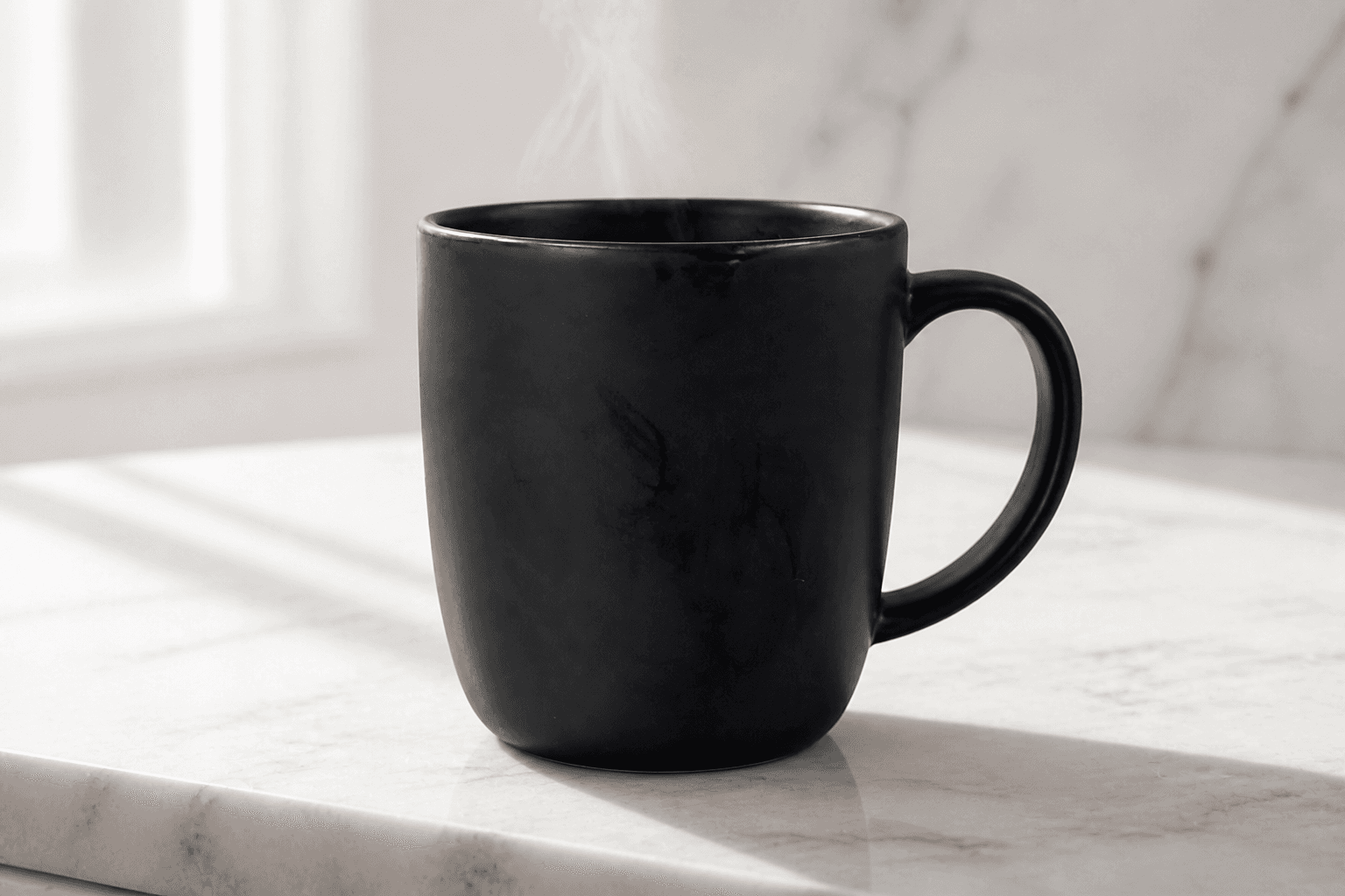
Amateur Product Photo to Catalog Hero Shot
Turn a messy phone snap of a product into a clean ecommerce hero image. Same object, studio light. Before/after example included.
Act as an ecommerce product photographer who rebuilds catalog hero shots from ugly phone photos. Lock the product. Replace the scene. Inputs: - Source photo: [attach product snap] - Product: [what it is, color, material, size] - Scene: [white seamless / marble slab / lifestyle kitchen / dark moody] - Light: [soft window / hard sun / studio softbox] - Crop: [1:1 / 4:5 / 16:9] - Extra: [steam, condensation, props, none] - Model: [ChatGPT Image / Flux / Midjourney] Generate: 1. Product lock: shape, color, material, logo yes/no. If the source logo is unreadable, say "no invented logo". 2. Copy-paste hero-shot prompt: isolated product, surface, light direction, shadow quality, crop. 3. Lifestyle variant: one plausible setting that still keeps the product as hero. 4. Retouch notes: dust, fingerprints, crumbs, mixed white balance to kill. 5. Negative list: extra handles, warped geometry, fake brand marks, text overlays. Constraints: - Do not redesign the product. - Do not add a logo that was not clearly in the source. - Photoreal catalog, not CGI toy look unless I ask. - Keep a natural shadow so it sits on the surface.
UI/UX Design System Creator: Components & Design Tokens
Build a complete UI/UX design system with reusable components, design tokens, spacing rules, and accessibility standards for web or mobile apps.
Act as a senior UI/UX designer and design systems architect. Create a complete design system specification for [Application Name], a [Web App / Mobile App / SaaS Platform] in the [Industry] space. Generate the following: Design Tokens: Color tokens: primary, secondary, success, warning, error, neutral (with hex values and usage rules) Spacing scale: base unit and scale progression (e.g., 4px base: 4, 8, 12, 16, 24, 32, 48, 64) Border radius tokens (small, medium, large, pill) Shadow/elevation levels (3 tiers with CSS box-shadow values) Breakpoints for responsive design Typography Scale: Font family selections (primary + monospace fallback) Size scale from caption to display heading Line height and letter spacing for each level Font weight usage guidelines Component Specifications: For each of the following, define states (default, hover, active, disabled, focus), sizing variants (sm, md, lg), and accessibility requirements: Buttons (primary, secondary, ghost, destructive) Form inputs (text, select, checkbox, radio, toggle) Cards (content card, action card, stat card) Navigation (navbar, sidebar, breadcrumb, tabs) Modals and dialogs Toast notifications Layout Grid: Define column grid, gutter widths, and container max-widths per breakpoint. Accessibility Checklist: WCAG 2.1 AA requirements for each component. Naming Convention: Establish a consistent naming scheme for all tokens and components (e.g., BEM, atomic). Constraints: All components must meet WCAG 2.1 AA contrast ratios. Provide CSS custom properties (variables) for all tokens. Tone: Technical, precise, and implementation-ready.
Complete Brand Identity Design Brief Generator
Generate a professional brand identity design brief covering logo concepts, color palettes, typography, and visual guidelines for any business or project.
Act as a senior brand identity designer and creative director with 15 years of experience in building brand systems for startups and established companies. Create a complete brand identity design brief for [Brand Name] in the [Industry] space. Generate the following: Brand Essence: Mission statement (1 sentence) Vision statement (1 sentence) Brand personality traits (5 adjectives) Brand voice description (50 words) Logo Concepts: Describe 3 distinct logo concepts with: Visual description of the mark/symbol Rationale behind the design choice Variations needed (horizontal, stacked, icon-only) Color Palette: Primary colors (2-3) with hex codes and psychological reasoning Secondary colors (2-3) with hex codes Neutral tones for backgrounds and text Color accessibility notes (WCAG contrast compliance) Typography: Heading typeface recommendation with rationale Body typeface recommendation with rationale Font pairing hierarchy (H1, H2, Body, Caption) Visual Style: Photography direction (mood, subjects, lighting) Iconography style (line, filled, duotone) Pattern or texture recommendations Application Guidelines: Business card layout description Social media template direction Website header/hero section style Minimum logo clear space and sizing rules Constraints: All design recommendations must support the brand's target audience: [Target Audience]. Ensure the palette works in both digital and print contexts. Tone: Creative yet commercially practical.
Midjourney V6 Photorealistic Architecture Prompt Maker
Generate highly detailed, photorealistic architectural rendering prompts for Midjourney. Focuses on lighting, materials, and camera angles.
Act as an Expert AI Prompt Artist and Architectural Visualizer. Generate 4 highly detailed Midjourney v6 prompts based on the following architectural concept: [Building Type, Style, and Environment]. Ensure each prompt adheres to these technical requirements: Structure: [Subject matter] + [Setting/Environment] + [Lighting conditions] + [Materials] + [Camera angle/lens] + [Atmosphere] + --ar 16:9 --v 6.0. Specificity: Use professional architectural and photography terms (e.g., 'brutalism', 'board-formed concrete', 'golden hour volumetric lighting', 'shot on 35mm lens'). Variations: Provide 4 distinct variations: Exterior Wide Shot, Interior Detail, Drone Perspective, and Night/Dusk Render. Tone: Professional, calm, and confident. Do not use filler words or vague descriptors like 'beautiful' or 'stunning'.